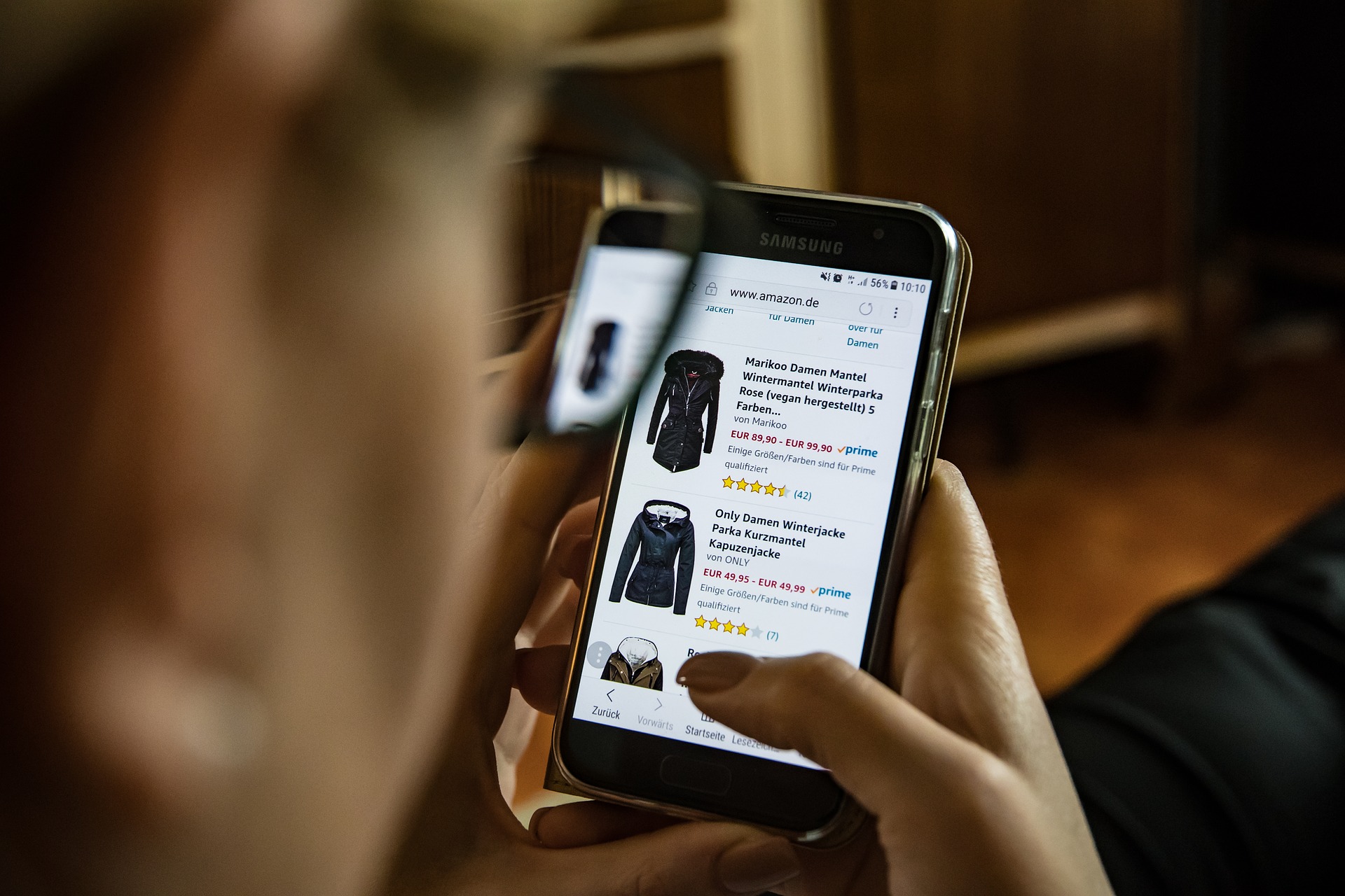
With the proliferation of mobile devices has had to come some rethinking in the way websites are laid out. If your ecommerce theme was conceived solely for a desktop environment, you’re going to have to move to one embracing finger-friendly design. While there’s more to creating a mobile site than just making things smaller to fit the screen, a lot of minimization is in fact required.
Here’s what you need to know.
Minimize Navigation
Mobile users, while enjoying unprecedented freedom, operate under two distinct handicaps. They might be moving while they use your site, plus fingers and thumbs tend to be less precise than a mouse and pointer. For this reason, your menus need to be simple and offer enough space for a finger to select an item without inadvertently triggering another one.
When designing menus, place your most popular choices at the top to minimize scrolling. Labeling needs to be clear and concise. Short-cut access for key features should be implemented as well. Touch screen tap points need space of at least 30×30 pixels. Links must be visually distinct and should change in appearance when activated.
Minimize Content
You’re working with a smaller screen and your users are impatient, so keep content to the minimum amount needed to convey the required product information. Flash didn’t make the trip to mobile, which has effectively rendered it dead. Stop using it. Page descriptions should get directly to the point.
Minimize Input Requirements
As you’re choosing an ecommerce theme, make sure it supports short URLs as well as alternative methods of inputting data such as voice. Forms should be as brief as possible, requesting only the most critical information for the task at hand. The need to scroll should also be kept to a minimum.
Mobile devices are less likely to be left activated and unattended. They also require fingerprints, facial scans or passwords for access. This means it’s OK to permit permanent sign-ins, which are inherently more convenient for shoppers.
Minimize Bandwidth and Data Requirements
Many of your mobile users are likely to be on data plans that throttle their usage after a certain amount of data is consumed. This will slow your site and impact their experience in a negative fashion.
To stave this off, your page sizes should be optimized for loading speed, and bandwidth hungry ad networks consuming large amounts of data should not be permitted access to your users.
Image use should also be minimized (but not eliminated) and images should be optimized for minimal data requirements. The use of embedded images should also be minimized to accelerate load times.
Mobile users tend to roam (hey, they’re mobile, OK?),so the odds of them experiencing a dropped connection are higher. Cache data on their devicesto ensure it retains your information if the device gets disconnected from the network.
Minimize the Need to Adapt
While more mobile users are getting comfortable conducting financial transactions on mobile devices, a large segment of them still prefers to make the actual purchase on a desktop machine.
If your product line has fine detailing, shoppers are also going to want to look at it on a desktop screen before making the final decision. For this reason, your site should adapt to the user’s device choice, rather than forcing the user to adapt to the limitations of your site. Your branding should be consistent and basic functionalities should be the same regardless of the environment.
Finger friendly design is about more than just making a smaller version of your desktop site. Content, input, navigation and data requirements need to be considered as well. With the population of mobile shoppers steadily growing, this isn’t a “nice-to-have” situation anymore, it’s now a “must-have.”


